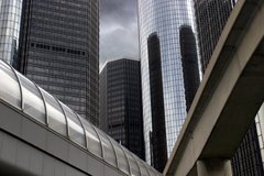
Renaissance Center, Looking up from Inside. This is the jewel of downtown Detroit. See more images by clicking on the Renaissance Center label below right.
Have a great weekend!
(My pictures are not posting the way the look on the screen before I post them--they are bother brighter and duller (less colorful or saturated) on the blog--any ideas how to save them?)


9 comments:
A superb shot!
I like the composition,light and lines in the photograph.
You keep getting better and better, Mary! Terrific composition. Gunn White said it all!
Not sure why your photos are different before and after posting. The posted ones look just fine to me. Are the pre-post photos smaller per chance? That would make a visual difference, I think.
It may simply be your monitor -- you could try tweaking that a bit...
I Love it! Have they reopened the rotating restaurant or is it closed for good?
I like this shot. Very cool Mary!
Thanks so much. I'm not sure about the restaurant, I think I heard it was there but not rotating anymore???
I don't think it's the monitor, becasue I'm using the same monitor to look at both shots. Both instance of one shot.
Wow! That is almost dizzying!
It is slightly vertigo producing!
I think the difference may be some setting in Photoshop that somehow got changed wrong. I don't know how to fix it.
The Photoshop images look great on the screen--until I save them and then they look too bright.
Post a Comment